IMPORTANT: Omniframe Mk II

Do you prefer the direction of Omniframe Original or Mk II going forward?


  • Total voters
    294
Status
Not open for further replies.

Schmuky

Base Commander
Base Commander
Apr 5, 2017
69
118
33
27
Transylvania
#61
Take the feet from MK2 and modify them to match the MK1. Then considering the MK1 should be a medium frame, it needs some more armor in the chest area (bc then the light will have nothing at all). Also love the small arms in the closed hatch on MK2.
 

Sempo!

Ashee, OP-AI Full Character
Jan 28, 2017
4
7
3
#62
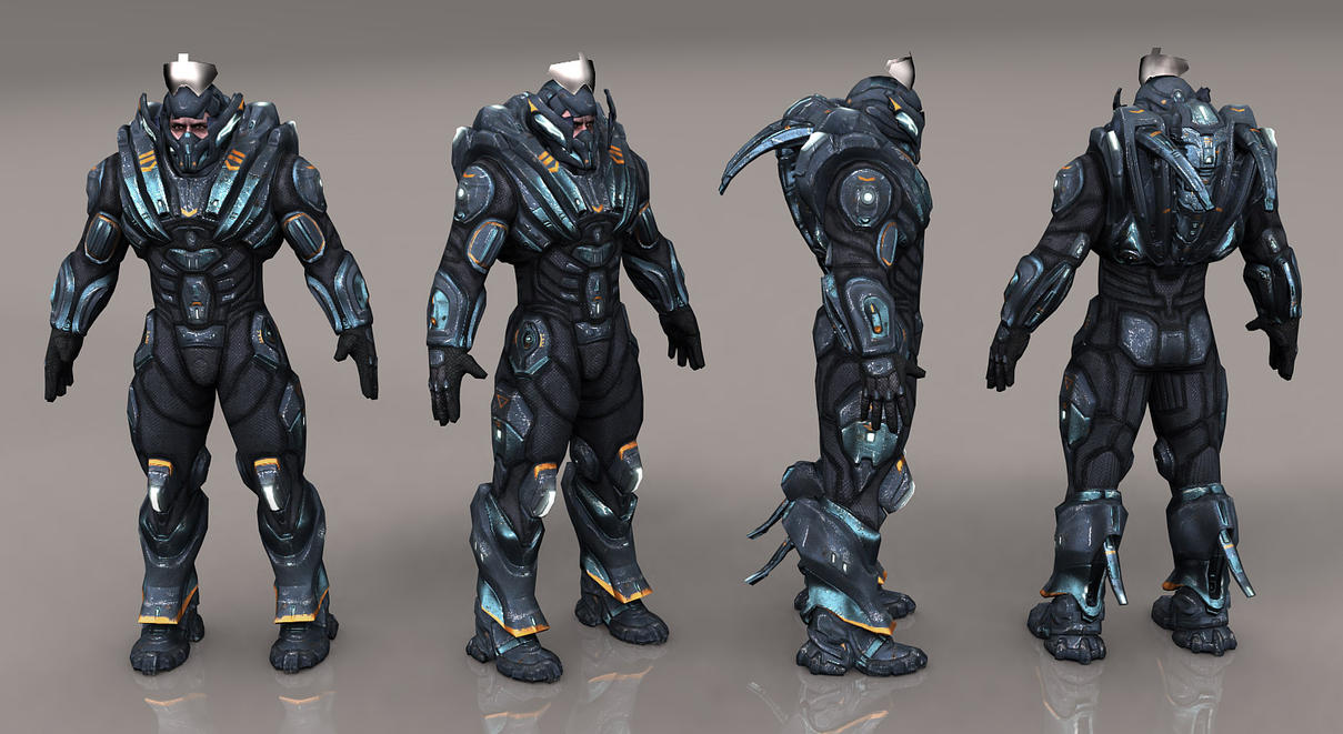
I love the less humanoid design of the original, especially the legs. I think the MK II looks good, but not nearly as interesting. On top of that, the original looks like it was designed to be an agile, all-terrain machine for operating on alien planets. the new guy looks, well, like a guy. I much prefer the original.
 

Hertz

Base Commander
Base Commander
Jan 26, 2017
4
4
3
#63
Prefer the original one the mkII look weird with the wings. But maybe it can be use In a different way.
 

Onwave

Terraformer
Nov 19, 2017
1
1
3
#64
In my opinion mk1 looks very nice. My only problem is with te feet, they should be abit bigger or have a diffrent shape like a tripod form.In their current state they look a bit small.(ex Artorias The Abyss Walkers armour from DS3
)
 
Likes: ObsoleteVodka

Darker7

Firstclaimer
Jul 2, 2017
20
42
13
#65
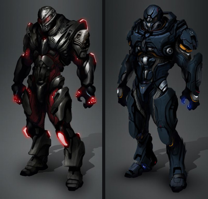
Important: Compare the artworks not a model with an atwork!

In my opinion the hard-driver mode's back should be the standard back.


Also Thumper size for comparison and potential to upscale Omniframe sizes:

Now, the Mk. II sketch as a reminder:

:Ü™
Edit: The Heavy and Light version of the Mk. I:

 
Last edited:
Oct 3, 2016
21
6
3
#66
I am extremely for the whole torso and arms ,the legs are abit generic .

I am however always a nut for a armored look on more armored idea,afterall we are at war ,so this for either the medium or heavier versions of the Omni (Mk2) would be a perfect thing ,Mk1 is great for the whole lighter or medium.


I would say the MK2 for any with decent or better on defense ,with the Mk1 for more speedy Omniframes
 

Heavymeerkat

Firstclaimer
Jun 24, 2017
2
1
3
#68
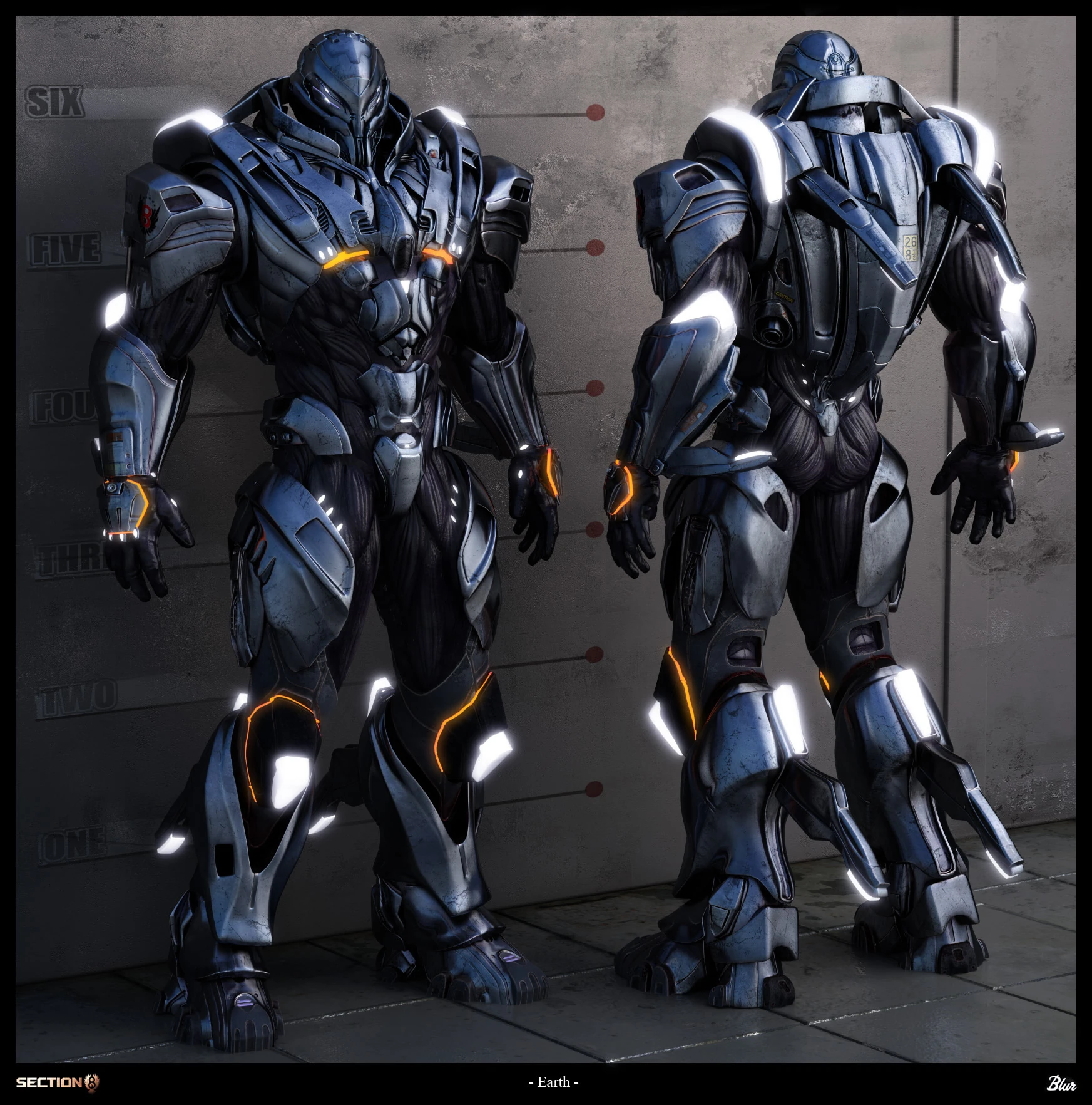
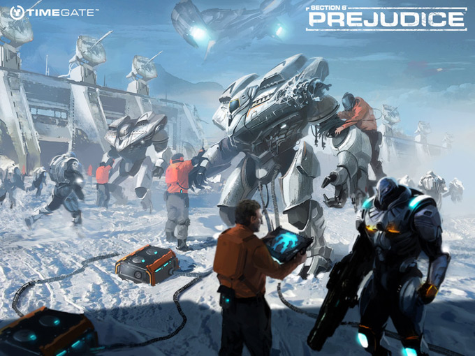
So i think the mark II looks good and i like the suit including the human arms in a protected state a bit, but i don't think the overall design looks very unique at all, it seems very generically exo suity to me. Similar to what Anthem has shown or what i personally immediately thought of Section 8 Prejudice.


So personally i prefer the idea of changing some stuff about the MK I and making it more like the art work, i don't have that many problems with the legs, but as others have said something does feel a bit off about them, however i think that the clamp like feet still fit pretty well. The MK II would still make a great base line for the heavy imo, as it looks far less mobile, really don't like the wings on it compared to boosters though.
 
Likes: Degiance
Jul 27, 2016
27
23
3
Ukraine
#70
Mk I is fine, but it's spine is really off. It looks too weak, and even in sci-fi concept I don't see how it would work. So spine definitely needs to be changed. As Darker7 said - Hard Driver mode should be the standart spine.
 

Wyntyr

Omni Ace
Ark Liege
Jul 26, 2016
6,336
11,602
113
Florida
#71
I'm going to go with MKI modified. Top down...

1. Lose the large yellow/black shoulder pads; add rounded pads over the section next to the current pads.
2. Round off the forearms to match the shoulders and thighs.
3. Widen the spine to about the same width, or just beyond, the pilot's width.
4. Widen the lower leg & feet.
5. Round the shin and top of feet.
6. Go from high heels to low heels.

Possibly add a second toe.
Possibly adjust the height of the frame up if need be.

Just one players opine.
 
Last edited:

Darker7

Firstclaimer
Jul 2, 2017
20
42
13
#73
I looked a little more intensely at the Mk. I and I think the feet aren't really that much of a problem considering/assuming that the feet aren't what majorly supports the Omniframe's weight. The Mk. I supports its weight mostly with its thrusters and the feet are just there to give acceleration, direction and some aid in supporting its weight, which would also be a faster and nimbler design than the Mk. II which supports its weight solely with its legs because it doesn't really have thrusters.

Assuming that we want to stick with the original design philosophy of Omniframes being agile and squishy :Ü™
 
Last edited:

Pyreflie

Deepscanner
Jun 20, 2017
8
14
3
#74
i like the heavy and light art but the original round model is cool too , it could be a supportive version maybe? just the feet part could use a bit of work and maybe a bit bigger armor plate on the spine of open model
 
Jul 26, 2016
42
46
18
Canada
#75
As it stands, I like the Mk.1 better.
The second pair of arms on the Mk.2 just looks awful to me, but if those were removed then I would like either model.
 
Jun 23, 2017
1
1
3
#76
To be honest I already find the current one cool enough, as a blend of both eastern and western mecha, they remind me of Xenoblade Chronicles X' mechas, but yours feel much more reasonable (arms/legs-size-wise), not to mention, you seem to have already put much work, thus hours, thus MONEY into it.

The Mk.II seems more in-line with eastern mechas, with human-like arms and legs being the giveaway, so you should think about the crowd you want to meet with this in mind, eastern (which means mostly Japan, since China should still be rather green on this matter so you have more of a leeway) or western?

Well, you could do both, with time, that is, since you'll probably want to monetize on cosmetics anyway I think it's bound to happen no matter what (to implement both styles, that is).

Usually, when developing games the most important thing is to bring out a fleshed out player controller that feels right as soon as possible, because it allows testing for: gameplay, combat, animations, systems implementation, skills usage, not to mention the morale impact on the developing team, it's a massive boost, to see your thing in action, ready for the world to come (quite literally).

Sure, the artstyle can be important in determining the graphics' style you want to run, but we're not arguing cell-shading over super-realistic so...

I think you should stick with the first one, that's your priority and you can't go wrong with priority driven development.


On a note I found this just the other day while scouring the internet for mecha images to get some inspiration:
https://www.kickstarter.com/projects/1609568567/code-hardcore-the-coolest-2d-mecha-battle-game

In the video they mentioned how they considered both eastern and western-styled mechas, so, heck, just contact'em to ask stuff, that can't hurt right? They're Chinese so you may want to check up on them to clear your doubts about that market.
 
Likes: Darker7

Darker7

Firstclaimer
Jul 2, 2017
20
42
13
#77
Tbh a lot of us are weebs, so japanese style wouldn't be a deal breaker but I think the mix is really important. You appeal to the largest group of people with it and more importantly it's original not a some already established style but something of its own :Ü™
 

Sigma957

New Member
Aug 6, 2016
3
2
3
#78
To be fair the current frame looks a lot like an mobile suit from the GUNDAM universes. The head is the Space Jahannam Klim Nick Use from G no Reconguista and the Bugu from G-Saviour.

The torso and lower bits are from Iron Blooded Orphans. I see bits of the Sinanju Stein from Unicorm 0096 in there as well.

The MK II also has the shoulder armor of the Barbatos Lupus. The rest of it looks closer to Pacific Rim's Gypsy.

At this point I would say just keep the Mk I because it's going to be nigh improbable to create something that doesn't look like it came from something before it.
 

Fireburn

Deepscanner
Jan 31, 2017
3
9
3
#79
To be honest both should be in the game .
The agile fast one and the tanky slow one
But if i have to pick a favorit its easy the second version .
I think a warrior should not show skin and be protected all the way .
the first one could be like a rogue but will be killed to easy if you want to be able to take a serious beating
 
Jan 27, 2017
9
20
3
#80
MKI legs hit the right notes for me, but the arms seem flimsy in comparison and don't share the same sort of structure.
MKII just looks like a bulky Iron Man suit, this isn't what I would call a mech.

Edit, looking again the panelling and scheme of MKII in relation to the thumpr is good maybe the proportions can be adjusted to fit section (shoulder armor and arm plating for example) into the MKI design.
 
Last edited:
Status
Not open for further replies.