Em-8ER Video Update #6 - OVERVIEW
- Thread starter Grummz
- Start date
- Status
- Not open for further replies.
Ok so...
1:43, the concept art is great... But the 3d model at 1:52 look really bad, and really nothing like the concept art.
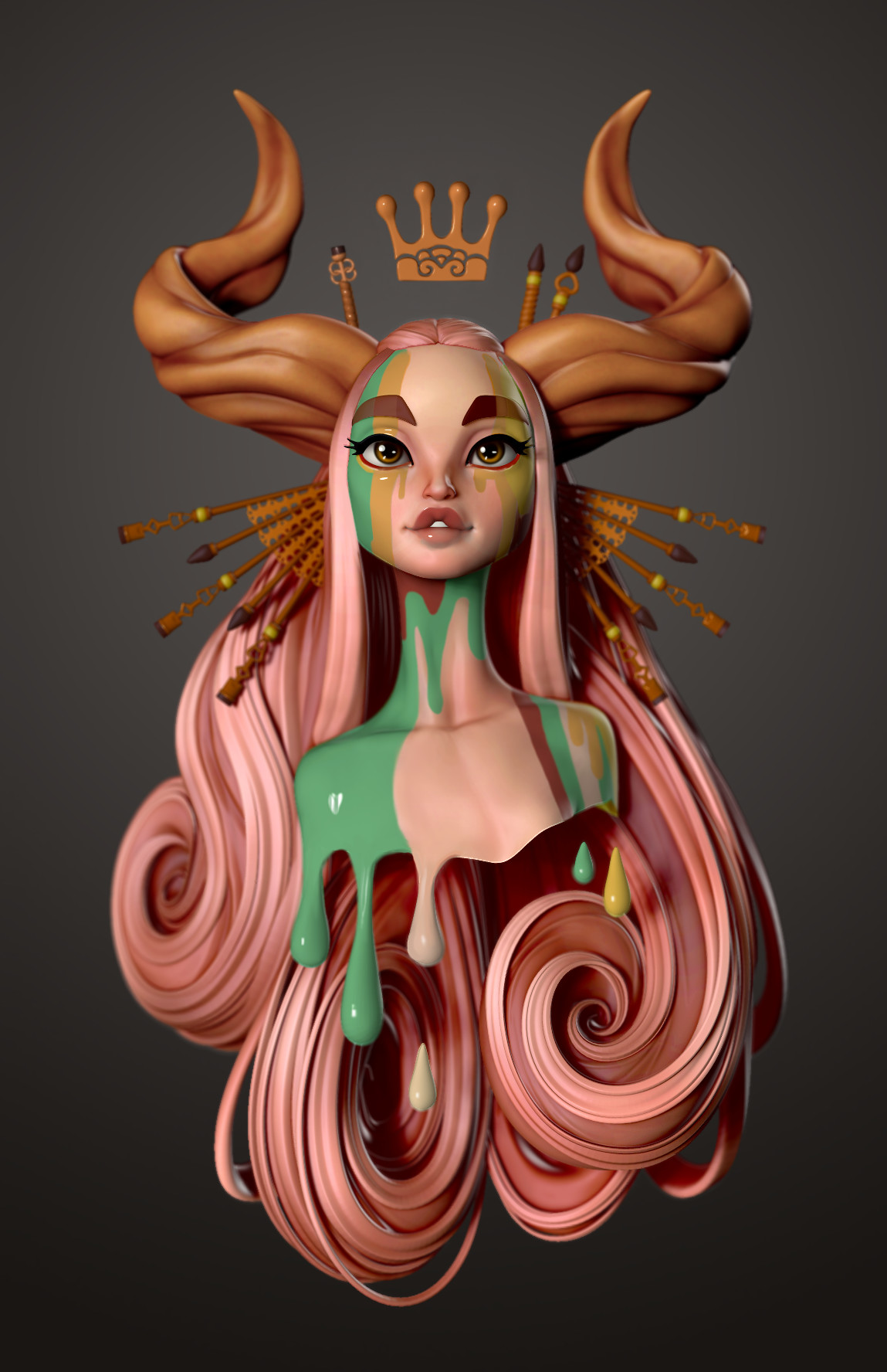
I'd be happy if you were to consider going into materials more like what Danny Mac 3D used to create this 3d model from the concept art of Jessica Madorran

Mainly the glossiness of the lips and general look of materials. The stylization of proportions is a completely different thing, I'm not suggesting a cartoony stylization.
Although, I think an unrealistic, closer to concept art stylization is a better approach than poorly made realistic art. Unless you get something like what unchartered 4 would've been 2018... The realistic approach always end up looking cheap, and ages really poorly.
For example, compare how Borderlands graphics has aged, to fallout... One has a game where characters look alright even today, while the other has really cheap and low quality looking characters.
1:43, the concept art is great... But the 3d model at 1:52 look really bad, and really nothing like the concept art.
I'd be happy if you were to consider going into materials more like what Danny Mac 3D used to create this 3d model from the concept art of Jessica Madorran

Mainly the glossiness of the lips and general look of materials. The stylization of proportions is a completely different thing, I'm not suggesting a cartoony stylization.
Although, I think an unrealistic, closer to concept art stylization is a better approach than poorly made realistic art. Unless you get something like what unchartered 4 would've been 2018... The realistic approach always end up looking cheap, and ages really poorly.
For example, compare how Borderlands graphics has aged, to fallout... One has a game where characters look alright even today, while the other has really cheap and low quality looking characters.
Do you mean the character specifically? I take it you mean the skin on the face and probably the hair?
Ok so...
1:43, the concept art is great... But the 3d model at 1:52 look really bad, and really nothing like the concept art.
I'd be happy if you were to consider going into materials more like what Danny Mac 3D used to create this 3d model from the concept art of Jessica Madorran

Mainly the glossiness of the lips and general look of materials. The stylization of proportions is a completely different thing, I'm not suggesting a cartoony stylization.
Although, I think an unrealistic, closer to concept art stylization is a better approach than poorly made realistic art. Unless you get something like what unchartered 4 would've been 2018... The realistic approach always end up looking cheap, and ages really poorly.
For example, compare how Borderlands graphics has aged, to fallout... One has a game where characters look alright even today, while the other has really cheap and low quality looking characters.
1:43, the concept art is great... But the 3d model at 1:52 look really bad, and really nothing like the concept art.
I'd be happy if you were to consider going into materials more like what Danny Mac 3D used to create this 3d model from the concept art of Jessica Madorran

Mainly the glossiness of the lips and general look of materials. The stylization of proportions is a completely different thing, I'm not suggesting a cartoony stylization.
Although, I think an unrealistic, closer to concept art stylization is a better approach than poorly made realistic art. Unless you get something like what unchartered 4 would've been 2018... The realistic approach always end up looking cheap, and ages really poorly.
For example, compare how Borderlands graphics has aged, to fallout... One has a game where characters look alright even today, while the other has really cheap and low quality looking characters.
Likes:
Mahdi
Ok so...
1:43, the concept art is great... But the 3d model at 1:52 look really bad, and really nothing like the concept art.
I'd be happy if you were to consider going into materials more like what Danny Mac 3D used to create this 3d model from the concept art of Jessica Madorran
[big pic snip]
Mainly the glossiness of the lips and general look of materials. The stylization of proportions is a completely different thing, I'm not suggesting a cartoony stylization.
Although, I think an unrealistic, closer to concept art stylization is a better approach than poorly made realistic art. Unless you get something like what unchartered 4 would've been 2018... The realistic approach always end up looking cheap, and ages really poorly.
For example, compare how Borderlands graphics has aged, to fallout... One has a game where characters look alright even today, while the other has really cheap and low quality looking characters.
This is a pre-alpha video with a lot of concept art and in progress work. Keep in mind the graphics, content and gameplay are currently being put together and what you see is just temporary in many cases.
There is a long way to go, so don't worry too much yet.
I was so busy replying I forgot to give my feedback on the video here! 
Awesome looking and sounding video @Grummz !!
Fabulous looking artwork @Tommaso !!
I can hardly WAIT to see the next update!! It will be a "standard update video".
Stay tuned and see you all then! o/
8 FOR Em-8ER


.
Awesome looking and sounding video @Grummz !!
Fabulous looking artwork @Tommaso !!
I can hardly WAIT to see the next update!! It will be a "standard update video".
Stay tuned and see you all then! o/
8 FOR Em-8ER
.
Fantastic update!
I especially like seeing the concept image of in action battle; The optics on the frame on the left are inspiring for sure and seeing the T.H.M.P.R. participating in the battle, that is amazing.
I know it's still real early, though the definition on the humans leaves a lot to be desired in comparison to the Mech definition (2:42). While players will surely spend much more time with the mech visual while playing and during battle, the humans still seem a bit more cartoony compared to the Mechs.
Maybe something that could aid @As7aro would be a little variety in the player exo-suits, which could be cosmetic options later on.
@Mallot ; Amazing artwork friend. I wish I had half the talent you guys do. Have to ask, why is the paint so glossy in some spots and so dull in others?
Likes:
As7aro and Pandagnome
That hits the spot. Concise yet comprehensive in picking out the features of the game.
Though, I must ask, is there a particular reason the enemies were referred to as 'Shifters' instead of the 'Tsi-hu'? I do realize that the name was the winner for the 'Alien Naming Contest', but it would make sense to refer to them by their in-lore name rather than a community-given moniker. All the more strange since the aliens are referred to as 'Shifters' at all instances (3x, 1:01, 2:17, 2:25) in the video.
Though, I must ask, is there a particular reason the enemies were referred to as 'Shifters' instead of the 'Tsi-hu'? I do realize that the name was the winner for the 'Alien Naming Contest', but it would make sense to refer to them by their in-lore name rather than a community-given moniker. All the more strange since the aliens are referred to as 'Shifters' at all instances (3x, 1:01, 2:17, 2:25) in the video.
Likes:
Rocket
What i have noticed
- Mark has turned invisible and can only be heard!
- The start begins with a huge mech and then down to a sleek g-suit lady
- Its in pre Alpha stage
- Concept art is stunning it brings the idea to life and thinking a physical wall paper in my room would look near the archlight!
- Researching to create things or selling the resource in the black market this is interesting
- This video update was the most informative for new folks and straight to the point
- now we shall share this video with everyone even your grannies!
Likes:
DinsdaleP13 and Faeryl
I definitely enjoyed this video more than the others, and that music in the background really suited the content. I have a couple of questions though.
With the Omniframe first-person view, will we be viewing from the character's eyes through the armour (like a virtual reality display inside the suit) or from the eyes of the Omniframe?
How exactly does the character control the frame? I might be a little dumb here, but it looks like the character moves the frame with their legs, but I can't see a control for the arms?
Also this. I'd be interested in purchasing a poster if it wasn't like $30 shipping.
With the Omniframe first-person view, will we be viewing from the character's eyes through the armour (like a virtual reality display inside the suit) or from the eyes of the Omniframe?
How exactly does the character control the frame? I might be a little dumb here, but it looks like the character moves the frame with their legs, but I can't see a control for the arms?
But can we get the concept art in higher Resolution for use as wallpapers?
Likes:
Mahdi and Pandagnome
Though, I must ask, is there a particular reason the enemies were referred to as 'Shifters' instead of the 'Tsi-hu'? I do realize that the name was the winner for the 'Alien Naming Contest', but it would make sense to refer to them by their in-lore name rather than a community-given moniker.
That in mind: Shifters is indeed the Tsi-hu's proper in-lore name, from the perspective of the Gatestriders.
Like how in the Halo series, Elites are the Sangeili's proper in-lore name, from the perspective of the Humans.
Do you mean the character specifically? I take it you mean the skin on the face and probably the hair?
Not sure what I think would go well with the hair, but I don't really know how hair physics work and it's limitations.
@Mallot ; Amazing artwork friend. I wish I had half the talent you guys do. Have to ask, why is the paint so glossy in some spots and so dull in others?
- Status
- Not open for further replies.


