What is your Custom logo!

Biz

Kaiju Slayer
Kaiju Slayer
Jul 30, 2016
37
73
18
#21
I could produce something decent if I had any idea of the limitations. Like is it a monochrome field with a transparent background or do you get colors, how many etc, does it have to be a bitmap or vector image etc. Do our "logos" have to comply with copyright, ai being wholly original artwork, can it be/include political/national/religious symbols or are there any other "censures" one has to pass.
 
Likes: Pandagnome

Torgue_Joey

Kaiju Slayer
KAIJU 'SPLODER
Jul 27, 2016
1,123
2,703
113
Germany
#22
I could produce something decent if I had any idea of the limitations. Like is it a monochrome field with a transparent background or do you get colors, how many etc, does it have to be a bitmap or vector image etc. Do our "logos" have to comply with copyright, ai being wholly original artwork, can it be/include political/national/religious symbols or are there any other "censures" one has to pass.
I DO REMEMBER I ASKED GRUMMZ SOMETHING SIMILAR.

-MONOCHROME (THOUGH I KEPT SOME COLORS IN MINE IN CASE THEY DO SAY YES)
-NO BAD WORDS, VULGARITY, SH*T, F*CK, B*TCH. AKA. GOOD BYE TORGUE'S DICTIONARY (NO "ALL RABBIT ARE BASTARD" FOR ME BECAUSE A.R.A.B. SOUNDS KINDA WRONG)
-NO NUDITY
-LOGO HAS TO COMPLY WITH COPYRIGHT. (WITH PERMISSION FROM ARTIST, YOUR OWN MAD SKILLZ, OR FOR EM8ER ASSETS ALSO WITH PERMISSION) (PPS: I HAVE GRUMMZ PERMISSION TO MODIFY THE BAD BACKER DECAL)

I CAN'T ANSWER THE POL/NAT/REL QUESTION. I'M AGAINST REAL LIFE PAIN IN THE ASS IN THE GAME.
 
Likes: Mahdi and Biz

EvilKitten

Well-Known Member
Ark Liege
Jul 26, 2016
777
1,557
93
#23
There is a reason why I felt better with keeping mine as a handmade symbol rather than some sort of complex picture. Also it is much easier to change something to black and white than add color to it later :)
 

Pandagnome

Kaiju Slayer
Fart Siege
Welcome Wagon
Happy Kaiju
Jul 27, 2016
7,896
10,171
113
Island of Tofu
#31
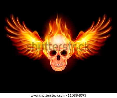
REMOVE THE BEARD AND IT WOULD BE MANLY AS F*CK.
It could have a flaming beard but i think it needs one strand of hair on the skull with the tip of the hair gleaming like an antenna hair but better!

I also like to see a triceratops horn on its chin so it can chinbutt enemies but that is optional
 

EvilKitten

Well-Known Member
Ark Liege
Jul 26, 2016
777
1,557
93
#32
It could have a flaming beard but i think it needs one strand of hair on the skull with the tip of the hair gleaming like an antenna hair but better!

I also like to see a triceratops horn on its chin so it can chinbutt enemies but that is optional
I couldn't find a flaming beard on the internet but thought this one looked rather cool:


Source
 

Pandagnome

Kaiju Slayer
Fart Siege
Welcome Wagon
Happy Kaiju
Jul 27, 2016
7,896
10,171
113
Island of Tofu
#37
I am thinking something like this:
View attachment 2767
I’ll just have to produce an original work, with my own fugly mug for bone structure/spacing, Also Lovecraftian theme seems vaguely appropriate here.
For some reason when i saw this was thinking of a bio-hazard logo with an image or rank in the middle
1547730556678.png

I also like this
1547730927506.jpeg
A good one for floating around or gliding

This one could be someone partying hard and being angry at the same time
possibly to dance the anger out after a unfortunate result
1547731146122.png
 

Attachments

EvilKitten

Well-Known Member
Ark Liege
Jul 26, 2016
777
1,557
93
#38
@Sy, I love crazy... (still a W.I.P.)

skull.jpeg
Darker background: Skull2.PNG No Background for hat: Skull3.PNG

EDIT: I tried making it with a monocle but didn't really think it looked right.
EDIT2: Final version I think, had to uniquify the skull, added the monocle. Enjoy!

1547832680855.png

I am thinking something like this:
View attachment 2767
I’ll just have to produce an original work, with my own fugly mug for bone structure/spacing, Also Lovecraftian theme seems vaguely appropriate here.
Biz that is totally cool, my only concern might be the aspect ratio, I suspect that the banners are going to be narrow and tall which might compress the image a bit?
 
Last edited:

Sy

Well-Known Member
Nov 16, 2018
367
721
93
sya.li
#40
Darker background:
No Background for hat:
I like the gradient on the hat, and I think the darker background works better to show its top. Regarding the eyes, remember that a logo will be greyscale.

I was immediately attracted to the curve and shape of the hat. To me, it doesn't appear circular and on an angle, it appears shaped and on an angle. I like it.

Personally I liked the beard, it seemed "ruffian".