The Touchy Subject of Maps

TankHunter678

Well-Known Member
Jul 26, 2016
369
311
63
#21
Right. given the usual nature of the game, I mark it down as an oversight that was just never addressed. To me, it would've made more sense for markers to be placed at better starting points for the hunt, such as at the entrance to the cave referenced in my above example, rather than on the exact horizontal spot of your goal and completely ignoring the vertical coordinates. It just made no sense at all.
Well honestly, I always found the mark directly on the object, never floating above the object or below it. When I got to you know, actually looking at the damn thing.

The hunt for me was usually finding the entrance to the area the marker was in. Finding the actual object itself once I got into the place? That was easy, the marker was right on it.

It was only the overworld map that only gave the X and Y. Once you were nearby you could see that it was inside the ground and you had to look for an entrance.

I agree though, if its going to be an interior thing then the entrance better also have a marker so you know where to enter to head to the objective.
 

zdoofop

Firstclaimer
Jul 26, 2016
531
766
93
Noneofyourbeeswaxistan
#22
Why are you so set on the fact that it absolutely has to be one way or another. There is nothing wrong with having 3D radar with vague 2D markers, as long as that serves the purpose of the design. Unless you think that makes the game more difficult, because you can't pinpoint the exact location, to which again I will say, if that is what developers want, than there is nothing wrong with that. Like they can put "2D" marker on 3D map, to show general spawn location of some enemy. You don't need to know anything more than that the area, including the elevation, around the marker is where you need to be, so why not just make it a simple 2D icon?

I just like never ever thought that a mini map or world map can be such problem for anyone. I guess as long as I got basic way to navigate around and some basic identifications for stuff, it makes no difference to me whatsoever whether it is in 3D or 2D, I will figure things out either way.

And once again, I thought FireFall world map did pretty good job at presenting needed info to the players. It didn't show the elevation, but I never had a problem with finding what I needed on it.
I'm talking about the radar being in 2 dimensions, not markers
 

EvilKitten

Well-Known Member
Ark Liege
Jul 26, 2016
777
1,557
93
#23
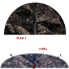
I actually could see a 3D minimap working with a minimalistic HUD. Since I am not really that good with photoshop let me see if I can explain it in words. On a top down map take a half circle, centered on the player location looking forward. Now rotate in 3D on the Y axis (players left/right) by ~60 degree's. Add elevation to that map circle to make it 3D. Now around that visually flattened half circle place the map compass with the cardinal directions and 30 degree measurements in small ticks. half circle changes as player rotates along with the compass, also obviously moves about to keep the player centered in the map view.

I tried my best to make some sort of graphical representation but it is crude at best...

HUD.png

What I can't do is have the terrain actually stick up out of the map...sorry my skills are limited, but I hope this gets the idea across. Any exact coordinate waypoints would show up with a corresponding Z axis shift which would show up on the minimap.
 

TankHunter678

Well-Known Member
Jul 26, 2016
369
311
63
#24
I kinda would rather stick with the classic top down minimap in the corner personally. Its simple, effective, and does not require costly animations.

3D radars with a compass are more a flight sim thing to me, and having one of them in the middle of the screen (which is the only place to put those half circle radars) draws my attention away from what I am shooting. Having the standard square or circle 2d/2.5d minimap up in a corner is something that is easier to ignore or just check every now and then.
 
Likes: Vladplaya

Daynen

Active Member
Aug 3, 2016
184
246
43
#26
The hunt for me was usually finding the entrance to the area the marker was in.
Yeah. this part is precisely the problem I was referencing. The map gave you the exact horizontal location of he object, but made no move to inform you "oh hey, you can actually get to it by backtracking a few KM to this cave over here." If the game wanted us to hunt for things, fine, design it that way, but if it was going to hold our hand to everything, then it should have been more clear on this exact issue, rather than an incomplete inbetween.
 

EvilKitten

Well-Known Member
Ark Liege
Jul 26, 2016
777
1,557
93
#27
I kinda would rather stick with the classic top down minimap in the corner personally. Its simple, effective, and does not require costly animations.

3D radars with a compass are more a flight sim thing to me, and having one of them in the middle of the screen (which is the only place to put those half circle radars) draws my attention away from what I am shooting. Having the standard square or circle 2d/2.5d minimap up in a corner is something that is easier to ignore or just check every now and then.
I wouldn't put it in the middle of the screen, lower left or lower right would probably be optimal. I also would keep it very simplistic, an elevation gradient so you can more easily see terrain features. I also drew it bigger than it needs to be.
 

Rocket

Max Kahuna
Max Kahina
Jul 26, 2016
199
324
63
Australia
#28
I'm not really seeing mapping as a touchy subject, unless you want to see it as a god given right.

Regarding the height co-ordinate, you sort of assume that the mapping co-ordinates are given primarily by satellite. So a lack of any height co-ordinate is reasonable in that regard. And that assumes an enemy that is not trying to scramble your signal. The ones we face appear to be intelligent enough for that.

I think 2D is good enough in that regard. If you want 3D, I think it's reasonable that a team place sensors to map terrain by line of sight. And those sensors should be tactical deployments, targets for aggression. You get the picture.

When playing in a group, these things get easier. When playing solo, it's an added layer of complexity. Seems reasonable to me.
 
Likes: ApisLove

Guardian548

SHIFTER
Ark Liege
Sep 21, 2016
9
12
3
27
The World
#29
It was from my understanding that these will be entire new worlds that we as players will be colonizing and opening for other players to help expand and defend from killer aliens. If so then why not have different maps available for certain things. Going to say a new world gives you a "Planetary Scan" with no real depth, basically topography map with only base features, but you can exchange map data with other players and collect it yourself via exploring. This gives you more options on maps I would think. You can have a map saying target Y is in this forest and have the forest highlighted but if you get the map data from a player who has been there it shows you paths through the forest and where in it to find your target. Think a dart board, outer circle is Planet Scan, inner ring is Player Data Exchange and the bulls eye is when you get there and find the target. This way you can have interactive mapping, especially if you are a player who likes exploring and you can give that data to others in exchange for currency or resources. It open whole avenues for player interaction!
 

Guardian548

SHIFTER
Ark Liege
Sep 21, 2016
9
12
3
27
The World
#30
It was from my understanding that these will be entire new worlds that we as players will be colonizing and opening for other players to help expand and defend from killer aliens. If so then why not have different maps available for certain things. Going to say a new world gives you a "Planetary Scan" with no real depth, basically topography map with only base features, but you can exchange map data with other players and collect it yourself via exploring. This gives you more options on maps I would think. You can have a map saying target Y is in this forest and have the forest highlighted but if you get the map data from a player who has been there it shows you paths through the forest and where in it to find your target. Think a dart board, outer circle is Planet Scan, inner ring is Player Data Exchange and the bulls eye is when you get there and find the target. This way you can have interactive mapping, especially if you are a player who likes exploring and you can give that data to others in exchange for currency or resources. It open whole avenues for player interaction!
Let me know if I'm wrong or got holes in my theory though. I'm happy to hear your thoughts.
 

EvilKitten

Well-Known Member
Ark Liege
Jul 26, 2016
777
1,557
93
#31
EM-8ER is a single world in the Crixa universe. I do not know if we will have other worlds down the line but even if that were to happen it probably wouldn't be for years after game launch? That is me simply speculating. With that said however I think that having players have their own waypoints and information that can be shared with others is kinda cool. It would be an interesting idea to integrate players into quests by making them part of the questline?
 
Likes: NitroMidgets
#32
The gates are effectively ways to make the world of Em8er available to go to other areas / places. The "World of Em8er" was to differentiate from FF IP not to actually say that Em8er was to be a world but that seems to be now changed (again) lol.

I still envisage that there's a gate nexus that enables you to travel between locations. instead of the Tardis that travels to different locations, it's several portals that are linked inside a room that GateStriders access to travel.


Minimaps

I guess they're game specific, is it a MMO specific? Some are basic to highly detailed.


I like the 3d style of the map you posted @EvilKitten, it breaks from the usual maps; somehow reminds me of Elite Dangerous :)

Mind you, this graphical approach is interesting too, comes back the artstyle.


I like the idea of sharing maps, uplinking and sharing places, but discovery is also a good thing for individual exploration; maybe exploration data like in ED, somehow I think it's out of place..

Also, I would love to see the whole interface customisable and movable as well than a static design, then you can make it your own style and liking. Perhaps there could be a gallery of themes people use that they can share upload/download.