So..elaboration on my thoughts...
View attachment 973
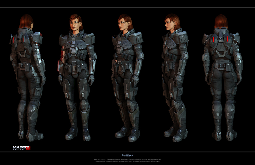
This is what I like and don't like about the g-suit concept art. My biggest issue is from my understanding the white area's are supposed to glow. But why are they glowey? huge glowing swaths all over a person is a giant target for anyone wanting to shoot at them, as such there (IMO) needs to at least be some logic behind its existance. What I do not like are the big thick area's of glow. I personally feel that the best look would be if the glowing came from "inside" the suit and peeked out through slots or overlap in the exterior suit plating. This would end up turning into more of a series of thin glow lines rather than big thick swaths like the male suit and female back legs have.
Obviously this is simple concept art, but I merely wanted to put my two cents in for the methodology behind the lighting.
(Also check mark for navel)
EDIT: also I would like to add that while I realize a lot of people love "sexy" outfits, I am really hoping that we end up with female g-suits that don't have giant boob appendages slapped on front. They need protection just as much as everything else! having them stick out like two big orbs is bleh.
not


