
Forum Feedback
- Thread starter Ronyn
- Start date
Privacy settings - https://forums.em8er.com/account/privacy
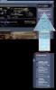
[_] Show your online status
Not honored. I can still see myself on the right, under "Members online" on https://forums.em8er.com/
--
- The forum's text box has a bold font, which I find loud and ugly.
- The changes to the font on the front page do not help with legibility enough. I maintain that the entire concept of text over an image (especially an animated one) is a Bad Idea.
-- Maybe have a strong-yet-transparent alpha "censor bar" behind the text.
-- Maybe there is some CSS option for text to have a border around a font.
-- Maybe edit the images directly to have the text embedded within, and use an imagemap to make those text areas clickable.
-- Maybe build multiple images that are stitched together, with some images having the text, and then have some of the images be clickable.
-- Maybe just have each item be one image be one link to one thing. Then have everyday text/links underneath. Stop being fancy.
-- However it's done, it's going to be work if you want to have that background image.
Because of the forum font, I'm literally getting a headache typing this out.
Will we be able to change our usernames?
Likes:
Mahdi, Faeryl and Pandagnome
Love the new setup of the website, it looks flash and cool,
i havnt recived my 20page PDF design book that i was meant to get as a Emberite i was wondering if i could get it resent to me?
")
Forums looking great!
Theres an issue with the settings page causing the layout to break if you collapse the sidebar.
https://streamable.com/ra16c
This should fix it:
Also, the code editor dosnt look too great atm as some of the text is invisible because of the theme used.

CodeMirror (the highlighter used on this forum) supports many themes out of the box, I'd suggest something like the monokai theme.
Shouldnt be much work to make that look great aswell
Theres an issue with the settings page causing the layout to break if you collapse the sidebar.
https://streamable.com/ra16c
This should fix it:
CSS:
.uix_sidebarCollapsed
{
    width: calc(100% - 270px);
    max-width: calc(100% - 270px);
    margin-left: 20px;
}
Also, the code editor dosnt look too great atm as some of the text is invisible because of the theme used.
CodeMirror (the highlighter used on this forum) supports many themes out of the box, I'd suggest something like the monokai theme.
Shouldnt be much work to make that look great aswell
Likes:
Pandagnome and Faeryl
Here are some thoughts it could be good to simplify so that having buttons with the same function and scattered could overwhelm the reader.
Some suggestions this way you have most of the important things gathered neatly and can access them with much less scrolling down the page.
Some suggestions this way you have most of the important things gathered neatly and can access them with much less scrolling down the page.
Likes:
liandri and Faeryl

Had a thought since there is an online status for those in forum could have a Demo/Game online status if not with the names of the player could instead have the numbers of players so as an example
Pacific Server [2]
Eu Server [0]
US Server [10]
We can see there is some in Pacific and US server so they will think ah i am going to hop over and see whats happening, sadly in this example EU is 0 oh well maybe later hmm
Not sure if this is possible to do but could be good way to gather more and see who is not just online in forum but in demo/game too.
P
I like the new image upload tool that lets you upload screenshots easily, very good work.
I like pretty much everything except 3 things, one of which Pandagnome may not like me for mentioning (sorry) haha.
The text and Color:
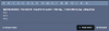
The color of highlighted text is still difficult to see, and the default font when writing is not the same as when it's all posted (the default one doesn't even exist in the font family dropdown menu). Selecting a new font and refreshing the page resets the selected font to the default one. And the default one makes it hard to tell the difference between certain letters. I have an example of this in the picture below, including a highlighted section if you can spot it.
It's worth mentioning that I'm using Opera GX with "Dark Mode BETA" enabled, but I have tried disabling it and all it does is changing some text from black to white like the Sidebar button. Meaning, Opera's DarkMode does not affect highlights.
Clutter:
I have a slight issue where people have large (whatever they're called) block logos, flyers, footnote images... The picture at the bottom of people's posts. It makes a clutter in threads and taking up useful space. I'd urge for a max resolution like something closer to 450x100 pixels, maybe even an option for an interactive one where various stats and titles linked to forum and/or the game will be displayed in the future.
More space and less clutter could also be achieved if the "Report" button was right next to the Like and Reply buttons, and moved to the same row as received likes for a master-row of interactions at the bottom. You could also remove the names of those who like and just put a number, there and let the names show up when highlighted with the cursor, or even have a small "show likes" buttons right next to the number.
(had to throw and edit in here):
As devs may not want or don't have time to respond to every thread (understandable), you could give created threads a status update like an icon showing if someone in the team have read and/or replied to the post, so people don't get the feeling that it was all for nothing or the message got lost in the masses.
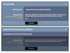
Here's the example from the picture, but now you'll see how it all changed:
light illumination - i've been ill - long live the queen - i like big... - i have bills to pay - pling plong
i = i
I = I
l = L
I like pretty much everything except 3 things, one of which Pandagnome may not like me for mentioning (sorry) haha.
The text and Color:
The color of highlighted text is still difficult to see, and the default font when writing is not the same as when it's all posted (the default one doesn't even exist in the font family dropdown menu). Selecting a new font and refreshing the page resets the selected font to the default one. And the default one makes it hard to tell the difference between certain letters. I have an example of this in the picture below, including a highlighted section if you can spot it.
It's worth mentioning that I'm using Opera GX with "Dark Mode BETA" enabled, but I have tried disabling it and all it does is changing some text from black to white like the Sidebar button. Meaning, Opera's DarkMode does not affect highlights.
Clutter:
I have a slight issue where people have large (whatever they're called) block logos, flyers, footnote images... The picture at the bottom of people's posts. It makes a clutter in threads and taking up useful space. I'd urge for a max resolution like something closer to 450x100 pixels, maybe even an option for an interactive one where various stats and titles linked to forum and/or the game will be displayed in the future.
More space and less clutter could also be achieved if the "Report" button was right next to the Like and Reply buttons, and moved to the same row as received likes for a master-row of interactions at the bottom. You could also remove the names of those who like and just put a number, there and let the names show up when highlighted with the cursor, or even have a small "show likes" buttons right next to the number.
(had to throw and edit in here):
As devs may not want or don't have time to respond to every thread (understandable), you could give created threads a status update like an icon showing if someone in the team have read and/or replied to the post, so people don't get the feeling that it was all for nothing or the message got lost in the masses.
Here's the example from the picture, but now you'll see how it all changed:
light illumination - i've been ill - long live the queen - i like big... - i have bills to pay - pling plong
i = i
I = I
l = L
Attachments
-
 19.5 KB Views: 6
Last edited by a moderator:
I just tried to post a Twitch video as media, but the Insert media dialog for some reason won't recognize the twitch URL
Likes:
Wyntyr and Pandagnome
I like pretty much everything except 3 things, one of which Pandagnome may not like me for mentioning (sorry) haha.
Even though do not want to read about it your right, the beloved forum must be saved!!
As devs may not want or don't have time to respond to every thread (understandable), you could give created threads a status update like an icon showing if someone in the team have read and/or replied to the post, so people don't get the feeling that it was all for nothing or the message got lost in the masses.
It hasn't been affecting all my posts, but sometimes when I'm pressing backspace to delete the final letter of a word, it will remove both the letter and the preceding space. I've only noticed it on the Em-8ER forum, not in any other websites or any other programs. I know it can happen on mobile, but I'm getting it on desktop occasionally. Anyone experience the same?
Likes:
Pandagnome

A very creative and great idea, I think this idea will be implemented and invented many other ideas.
Soundcloud it would be good to have audio things. As an example players who take part in the game can speak out to the host preferably in a chat show just like those radio stations.
We can call it Radio Reaper and this will be an underground station.
What does it have to do with the website though well i think it could be found on the site and can be listened to on the go without reading or watching things.
P
First I'd like to bump my old post where fonts are messed up and not even listen when making a new post/thread, this non-existent font converts itself to a normal (readable) font upon posting, probably Aerial or Times New Roman, idk which it becomes.
Then I found a new issue, regarding "Backspace" under certain conditions... I haven't exactly figured it out yet but I'll attach a GIF showing the issue in action. What it does, is deleting both the last letter of a word, then if you delete the first letter it also deletes the "Space" infront of it, making edits very tedious.
(edit); Apparently I wrote word instead of letter, and sentence instead of word... Fixed.
Attachments
-
 18.7 KB Views: 5
Last edited by a moderator:
Likes:
Pandagnome and Faeryl