Em-8ER Video Update #5

Status
Not open for further replies.

Ronyn

Commander
Staff member
Community Manager
Director of Marketing and Community
Jul 26, 2016
724
2,706
93
#1
Edit: Here is Update Video 5!

--------------------------------------------------------------------

Original message: The team is working on getting the latest update video finished so we can share it. We expect it to be done tonight sometime and we will post as soon as humanly possible. Thanks for bearing with us!
 

Maven

Kaiju Slayer
Max Kahuna
Philanthropist
Jul 26, 2016
262
1,197
93
#5
Thanks for the update.

Just a few things I'd like to note here:

1: The update was to be all about the Omniframe in-game model being revealed (granted its not textured yet, momentous occasion nonetheless). However, there's far too less time being spent on actually showing off the omniframe, 0:31-0:40, about 9 seconds. The section could have been a bit longer.

2: There's far too much empty section at the end of the video, 2:35 - 3:27, almost a whole minute. While the music is absolutely lovely, it just gives the impression of filler material. This in turn makes the video feel extremely rushed.

I'd feel that the priority should be on making the update feel meaty instead of just rushing it out for the sake of getting it out of the way.

All said, great to see things moving on, and the omniframe looks pretty good.
 

Biz

Kaiju Slayer
Kaiju Slayer
Jul 30, 2016
37
73
18
#6
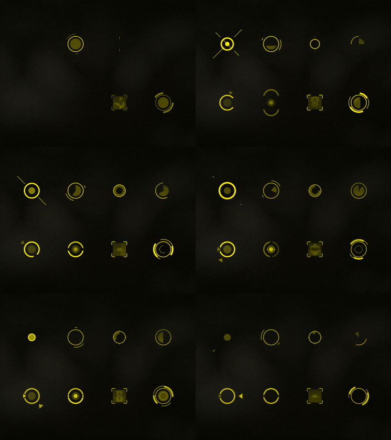
UI - What are those shaded half-ovals next to helth and energy icons. Do they have a reason to be there? Are they perhaps "shield" indicators?
Also - Targeting reticle - is it dynamic? Do those 4 quarter ovals show the actual spread of the projectiles or are they there just to make it look more sci-fi?

Spikes everywhere in/around the bases better have an in game function, like used for impaling upto mediumsized mobs (something comparable in size to omniframe that tackles it on to the spike/pushes it into one) - being express elevators to bad-guy afterlife I can see how explorers short on resources in a hostile, barren planet would take time and effort into constructing those. OR perhaps Do they block Really big mobs from hugging the walls?
 
Last edited:
Likes: Pandagnome

Pandagnome

Kaiju Slayer
Fart Siege
Welcome Wagon
Happy Kaiju
Jul 27, 2016
7,896
10,171
113
Island of Tofu
#8
1) Mark your hair is growing in no time for a nice modread :cool:

2) The plant pot needs to be in the video maybe someone who was involved can peek their head out for surprise visit
like in mortal kombat games when they say toasty

3) The baked frame ahhh i cannot wait to see the colour and animation

4) heads up display is nice the reticule is that from firefall?, the health and energy i would change colour
to me green for the health the blue for energy but thats just little things i am sure there is option for that to customize where certain things are on the screen and having a mini map somewhere.

I also like the high contrast especially at night time some toggle to switch the brightness of the heads up perhaps?

for scanning something like these are nice i like the square one
could show a logo of hostile with a skull or friend with a happy face etc

I like this as it has a compass on the top and dots representing destination targets or individuals plus the radar like map
at the bottom looks nice

I like how its simple because too much information can be well too much :D but could we toggle certain things on and off or disable things we do not need but some of us love info say it was a recon who wanted to know the altitude of a platform, the temperature and distance from the target and so on that he or she can get there to cover their team mates with the right info etc etc

5) A target pew pew pew pew pew i wonder how it will move hmm

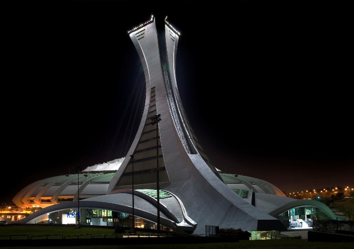
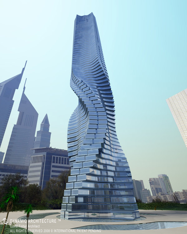
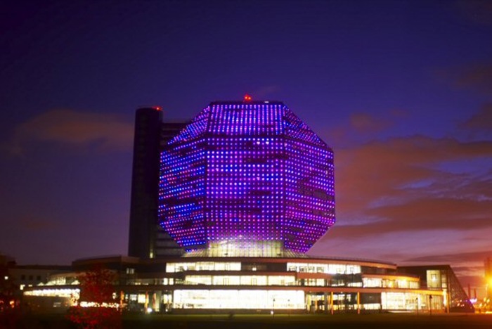
6) Bases, hope it will be like the chosen mashed with high tech tron, unique shapes, organic and synthetic materials, and other influences! Some shapes from iconic buildings like the pyramids and others below i like




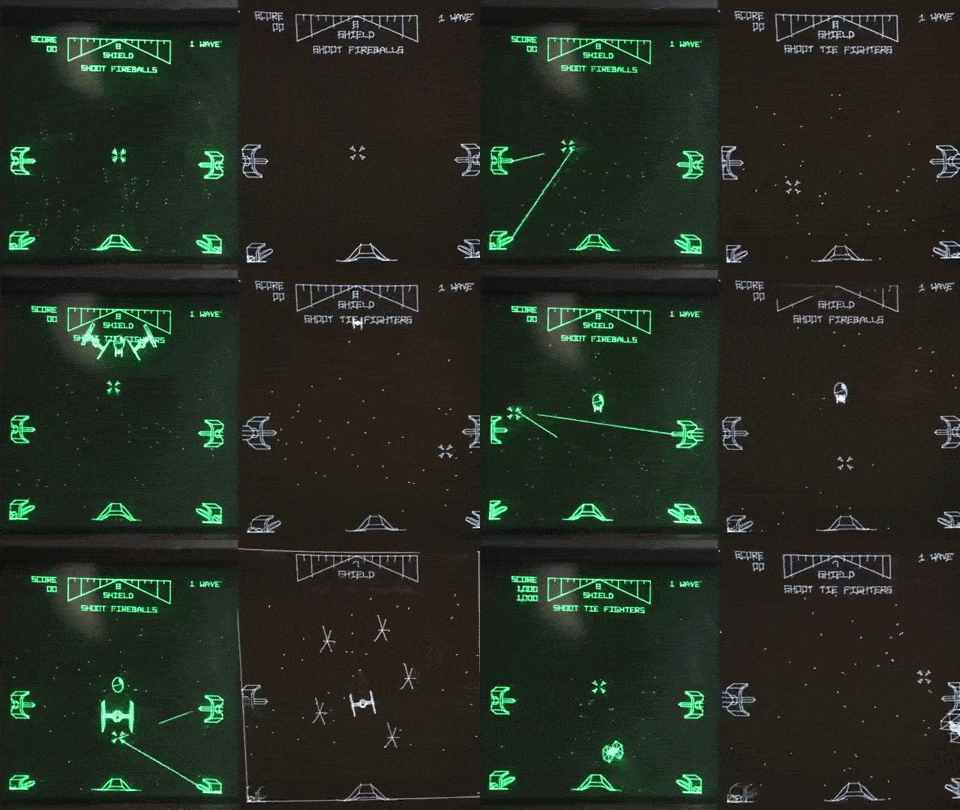
 

Grummz

$6k package
Community Manager
Ember Dev
Jul 25, 2016
809
6,724
93
#9
So you want us to talk more about the Omniframe while showing off closeups? Sometimes we save this for when the piece is fully textured.

By empty section, do you mean the end of the video? That was done the first time to let people hear the music fully. We just use it again without much though, but we can trim it down.

The updates already take an hour on Sunday to setup and shoot and the whole Monday to capture footage and put together. I'll look at ways to increase content without taking up half the week to do. By "rushed" I think you mean the pacing of the video, how fast we go?


Thanks for the update.

Just a few things I'd like to note here:

1: The update was to be all about the Omniframe in-game model being revealed (granted its not textured yet, momentous occasion nonetheless). However, there's far too less time being spent on actually showing off the omniframe, 0:31-0:40, about 9 seconds. The section could have been a bit longer.

2: There's far too much empty section at the end of the video, 2:35 - 3:27, almost a whole minute. While the music is absolutely lovely, it just gives the impression of filler material. This in turn makes the video feel extremely rushed.

I'd feel that the priority should be on making the update feel meaty instead of just rushing it out for the sake of getting it out of the way.

All said, great to see things moving on, and the omniframe looks pretty good.
 

Grummz

$6k package
Community Manager
Ember Dev
Jul 25, 2016
809
6,724
93
#10
UI - What are those shaded half-ovals next to helth and energy icons, do they have a reason to be there, are they perhaps "shield" indicators?
Also - Targeting reticle - is it dynamic? Does it show the actual spread of the projectiles or are those 4 quarter ovals there just to make it look more sci-fi?

Spikes everywhere in/around the bases better have an in game function, like used for impaling upto mediumsized mobs (something comparable in size to omniframe that tackles it on to the spike/pushes it into one) - being express elevators to bad-guy afterlife I can see how explorers short on resources in a hostile, barren planet would take time and effort into constructing those. OR perhaps Do they block Really big mobs from hugging the walls?
As some have guessed, the reticule is from Firefall. We snuck it in to see if people would remember. We'll have our own reticule moving forward. The reticule will vary by weapon. They will animated and show spread, hits, etc. in the final version down the road.
 

Maven

Kaiju Slayer
Max Kahuna
Philanthropist
Jul 26, 2016
262
1,197
93
#11
So you want us to talk more about the Omniframe while showing off closeups? Sometimes we save this for when the piece is fully textured.

By empty section, do you mean the end of the video? That was done the first time to let people hear the music fully. We just use it again without much though, but we can trim it down.

The updates already take an hour on Sunday to setup and shoot and the whole Monday to capture footage and put together. I'll look at ways to increase content without taking up half the week to do. By "rushed" I think you mean the pacing of the video, how fast we go?
1. The omniframe could have got a bit more screentime I feel. Right now it got 9 seconds, enough for a quick view from the inside and a once-over. Views and a pan-across with a black background followed by the same with the environment background. This could also include further shots comparing the thumper, the old design and a shot with the human model. There would be no necessity for a running dialogue in the background, in fact it would be a very good chance to just leave the music running.

It's almost artificial inflation of the video duration, but it gives it a bit more content and a little variety.

2. I'll explain the empty section better: The 1st update was 6 minutes long, with about 28 seconds of music at the end. Video update #2, was 4:38 long with about a minute of music at the end. Update #3, 4:57 with a minute of music. Update #4, 4:19 with a minute of music at the end. All those gave atleast a good 3 minutes plus of content. Update #5 was just 3:28 with the same minute long music sequence. That's almost 1/3rd of the video taken up by the music alone which gives the impression of filler material, or rather, a way of stretching the video out for a bit longer.

The music at the end need not be trimmed down. I'd like it if the content in between was given that artificial inflation and extended out a bit, being subtle of course, and then have the music close it out at the end. The music needs it's limelight of course, but having 1/3rd of the video taken up by music and the logo screen just gives the impression that there was an attempt to fill something in there, due to a lack of content, and prolong its duration.
 

Faeryl

Omni Ace
Staff member
Community Manager
Kaiju Slayer
Jul 26, 2016
943
2,637
93
Planet Earth, USA, East Coast
discord.gg
#12
As some have guessed, the reticule is from Firefall. We snuck it in to see if people would remember. We'll have our own reticule moving forward. The reticule will vary by weapon. They will animated and show spread, hits, etc. in the final version down the road.
Hey @Grummz , funny you should mention that because that was exactly what I thought when I saw it. :D

My thoughts on the heads up display and reticle (for down the road of course as time and funds allow): Would it be possible to allow players to have the option to change the amount and/or size of information available? I'm all for options and choices; and this would satisfy both the people who want ALL of the data and the people who want SOME of the data. ;)

*edited to add ...
Oh and I do agree that having a longer look at the footage of the human model, omniframe Mk.II, and THMPR together would be awesome; even if it was in slow motion with music. Folks have been asking about scale of size between all of the characters that will be in Em-8ER. So having the slower footage and maybe a single still image of the same would be good for showing scale of size. :)
 
Last edited:

Dreamin

Base Commander
Base Commander
Dec 4, 2016
92
139
33
PNW
#15
Thanks for another well done update Mark.

I haven't commented on the last couple as there really wasn't much I felt my input could assist with.

I kind of like the human/pilot UI overlay, but just for when the pilot is outside the frame. Even though the frames are "open cockpit" I feel the UI should switch when entering into it and become stationary a little like some of the old Gundam UI's where the pilot can look into the peripheral, past the UI, without turning the mech necessarily while staying somewhat third person view.

As for what @Maven has mentioned, I somewhat agree. The updates are seeming to have less update, maybe consider adjusting them to 7 -8 minutes with releases every couple weeks instead of weekly. To me it seems like the updates consume a lot of time, 8 - 10 hrs+ to produce which could be better vested in other portions of the project, I could be wrong.

Ten to fifteen second wacky clips of you or the other designers in progress of doing your thing added in would also spice them up a bit and help the community to get to know all of you in more of a "personal" sense rather than just the businessy developer sense.

Seeing the start of the base and comm station creation is inspiring, I know it is just in the works but these features added to all the work you have accomplished already brings the feeling that future playability is just on the horizon, even if it is really a long ways off still.

P.S. From Update 4; it is good to hear that the server work has begun. I myself am hoping that some of this will be scalable enough that in a future fund raiser you'll include framework to bring up a small test server prior to the need for the larger online network servers.

Anyway, Cheers and thanks again for the update.
 

liandri

Omni Ace
Omni Ace
Jul 29, 2016
450
1,119
93
Zone of Bones, Australia
#16
I'd have to also agree with Maven's points. However, still love the updates. It's engaging and hype-building enough that I've thought about Ember more in the past couple of weeks than I have since the Kickstarter was completed.

The UI I don't mind too much, but I had to stare at it for a little while to figure out exactly what all of that meant. I personally prefer numbers or a large bar so my health and shields can be tracked better. Like, for example, the jetpack meter in Firefall was very easy to see, only appeared when used, and you knew exactly when you were about to fall to your doom.


Grummz

$6k package
Community Manager
Ember Dev
Jul 25, 2016
809
6,724
93
#19
The weekly video updates are hard on me, I have to admit. Some weeks we just don't have a lot to show. Bi-Weekly might work out better. But this week I'm doing a "what is Em-8ER" video for those new to the concept.

Would bi-weekly satisfy the community and keep the momentum going?
 

Maven

Kaiju Slayer
Max Kahuna
Philanthropist
Jul 26, 2016
262
1,197
93
#20
I'd be fine with a bi-weekly update, if that's what is needed to have a substantial update in terms of content. Updates need not be churned out for the sake of having an update. Anything in between can be a short hop into Discord and a 'Hi, this happened'.

Especially since the video updates are meant to reach a larger audience outside of the current community. It needs to feel impactful.
 
Status
Not open for further replies.