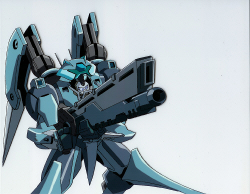
Friday Update - Omniframe Tweaks Done
- Thread starter Grummz
- Start date
- Status
- Not open for further replies.
Thanks for all the great responses. It seems to be regarded by a large number of respondents here (and on Twitter) as a vast improvement, while some have some caveats. So a few points:
1) The omniframe renders are wide angle and lower to the ground. This makes some parts in the back (like the wings and engines) look smaller, or more hidden, than they actually are. They are smaller, relative to the figure, but not as much as it appears. The wings are also stowed vertically up and down on the back and not semi-relaxed and spread like in the concept. Also, NOTHING looks perfect from all angles, even supermodels on magazine covers. When you see it in 360, it will have good views and not so good views. This is just natural and we try to minimize it as much as possible, but you will always be able to find a bad or awkward camera angle.
2) The omniframe is not in its hunched/crouched pose, but standing tall, which gives a different look without it's intended pose. This also alters the appearance from the concept. We will have a posed version to show you soon.
3) The feet will have joints and articulate more than the render. We may not model hinges that you can see, but the rigged for animation version will have more articulation in the front of foot and side flaps.
4) Skins will wildly vary the head, shoulder pauldrons, wings, jet pods, thigh plates forearms and lower legs. There will be several styles to choose from. Also this is the medium frame. You can expect more bulk in heavy and slimmer versions in light when the game ships. I'm sure you will find your favorite style as the game goes live and we start to offer a lot of cosmetic options to help tweak the look of your frame.
5) I'm very very happy with the redesign and overall quality and look of the frame and think it will look even better once we have the human pilot inside and everything "in-engine."
When we first unveiled the Omniframe concept, before anyone had seen the 1st drawing, the reaction was really torn. We had a large number of people unhappy with its larger size, open cockpit, delicate spine and "chicken legs." Well, maybe more than torn, it seemed like most were supportive but had a lot of issues with the concept. One thing you all made clear: take the feedback, but don't switch around to chase the feedback and change things over and over like Firefall.
I responded back then by saying that first and foremost, the game director (i.e. me), has to be happy and excited with the design and have it match my own personal taste. If not, then I would have less and less motivation to work on the game. As part of the very difficult and often discouraging creative process, I have to be self-thrilled with what I am making or you won't get the best results. So, if I make changes, you can be sure the root cause is that I want something better, or something that excites me more. THEN I take in community feedback and ideas, and pick and choose from all the great ideas, the ones that really excite me or help me achieve my personal vision. I'm very happy with the way the process has been working and how fun it has been to get the community involved. From the Mk II survey to all the comments on the Omniframe since it's first unveil, I've listened and picked and used your ideas as a springboard, yet maintained my creative vision. YOU helped me get closer to what I wanted for the game, I simply could not do it without your reactions (good and bad) and ideas. So thank you for that!
NEXT STEPS:
While the high poly is done, or very close to done, we still have to remake and bake out the low-poly version for the game-engine. I hope to have this done soon in early January so we can hand it to the rigger. The rigger add all the joints and controllers that lets our animators work with the model like a puppet.
After that we will animate walking, running, turning, jetting and gliding, but not weapons. This is to get the movement feel right and fulfill the Omniframe movement demo milestone.
After that it's basic combat, getting a gun into the Omniframe's hands and shooting at some static targets to get some weapon feel going and blow some stuff up, even if its just cubes.
And so on, step by step.
Thanks again for the feedback and keep it coming. I read it all!
- Grummz
Feels too tiny, and too normal in its legs, shoulder/engine sections are gone/small/smoothed over too...
Overall it went from feeling like a large high powered MECHA to being a simple exosuit.
My overall excitement when seeing this was quickly turned into a sudden sense of disappointment and then a bit of a familiar sense to when I see april fools posts but with no such hope here.
I don't want to say it's bad, but it lacks the uniqueness and form that made me really like the original mk1s art and design (and I don't just mean little surface panels, colors, sleakyness, and other bits that on a lower poly could be nothing but texture, I mean the larger structure and form and how it all was proportioned that made for its overall silhouette). It looked like it had reall weight in parts of it, its broader shoulders letting the arms swing about in ways a human proportioned unit can't that looks more interesting, the relatively small lower legs adding to the idea that it can half glide over surfaces when mixed with the giant engines that took up half the upper shoulders area on the old one...
So overall I just of go, "eh" and don't really care much one way or the other when I see this piece. Kind of like a lot of random deviant art posts or other things you scroll through where sure it looks ok, but it doesn't grab your attention and make you really stop and look at it or possibly favorite it.
I do like the new one, sum what, only because of the more neon genesis appeal, however It isnt what i was expecting either, not disliking the new one, i like it, but I like the old one more

^ This looks badass, looks very military, every detail looks like it has a purpose and wants to jump out at you with its stance, the wings are good size and not in the way.

^ This also looks badass
More complex details and body panels than raw metal like the new design

Not hating but... This pic to me best points out the flaws of the new one, it looks more basic, basic joints and limbs and exposed. The wings are way too small.

^giving the old omniframe design a comparison... this is what it looks like, definite preference to the new one, to me at least, maybe it needs to grow on me ^.^
Last edited:
Likes:
Darker7
I'd still love to roll around in the original version but I will say the tweaks turned out wonderfully. Really great responses from the team to the community and sticking to what has been a strong formula of success for Em-8er project. One thought I had is the original is a technological design from the western frontier attitude while you could have the tweaked version being the big city corporation configurations. This is coming along great and constantly moving forward! Twitching for a download to log into.
@Grummz I fully support you sticking with designs that excite you and follow your vision for the game. It's very cool to see you use ideas from the community, that gives us more of a personal stake in the game. Just a little encouragement, remember...there's a time to put the paintbrush down and to stop second guessing and move on to next steps.  Keep up the great work; can't wait to play your vision!
Noticing this healthy trend where the new design reminds people of all the mechs they have loved/liked in the past.
If it reminds you of something, you can relate to it and if you can relate to it. It makes it that much easier to get in to the game and have the feeling of:"This is my omniframe, there is no other omniframe like it as this is mine.". If i can say it like that.
I just wanna see those lights light up as it's activated and the hear some kind of iconic sound that indicates that the omniframe is now alive and ready for action. So i can have a small geek out moment screaming:"She's alive, alive!"
Likes:
Pandagnome and Mahdi
Well it does look better than the old MK1.
Shoulder and the shin is kinda weird though. And i can't say i like the pointy fingers in the hands.
I mean, look at this
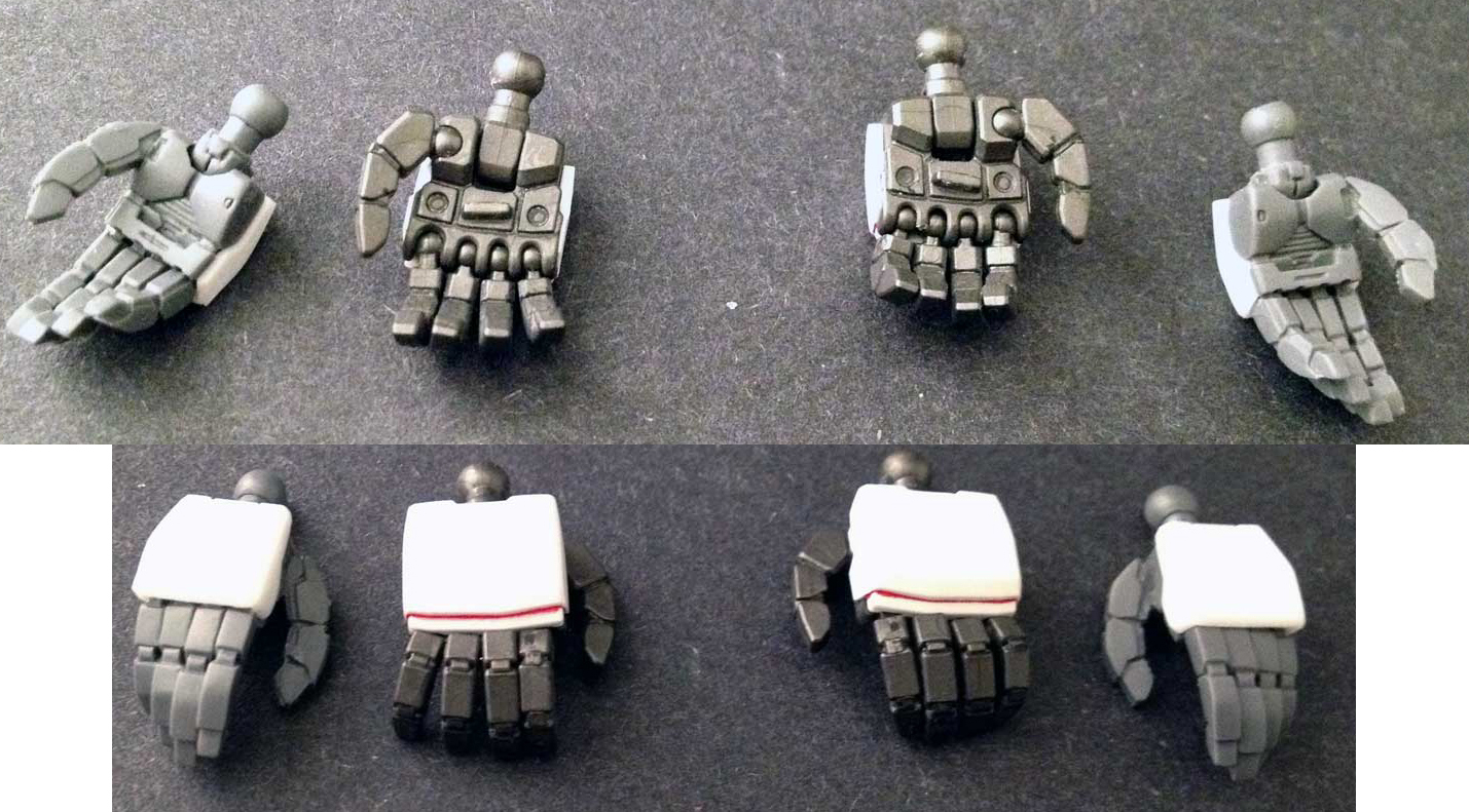
Ya i think this looks better than the current hands of the Mk1
Above is the High Detail Manipulator for the MG Gundam Unicorn
Shoulder and the shin is kinda weird though. And i can't say i like the pointy fingers in the hands.
I mean, look at this

Ya i think this looks better than the current hands of the Mk1
Above is the High Detail Manipulator for the MG Gundam Unicorn
Likes:
spiralofhope
Ya, a lot of it is the shorter seeming arms and bulkier midsection/legs when compared to them. I just kind of like the whole bigger heavier armed feel of a Mecha with the more top heavy aproach rather than the more human proportioned one. Looked through some others and found some pics that helped me focus on some parts.
I know at this point it's unlikely to result in any real change, but still I do have a vested interest in the development of ember and how it ends up so I'd feel remiss if I didn't try to help make my viewpoint a bit more clear here.
I know at this point it's unlikely to result in any real change, but still I do have a vested interest in the development of ember and how it ends up so I'd feel remiss if I didn't try to help make my viewpoint a bit more clear here.
Longer arms, heavier feel on the limbs that you carry stuff with, smaller feet also make it feel more top powered. The back suit part is not something I'm as much of a fan of here, but overall I like many of the other parts proportions (and this is a possible skin/theme/idea in the future, pineapple...)
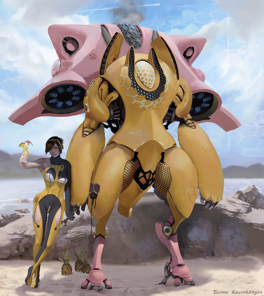
Diva, she started off a bit closer to a more balanced looking type, but they moved more towards the larger top part with emphasis on engines and stuff feeling like they can move it. Key part I like with it is the part that it also clearly reads as a mecha with more mechanical parts and surfaces that don't just look like continuations of a human form or armor setup. Something they moved away from throughout her development. They made the mecha look more like a machine the user is in, rather than just a large robo human.
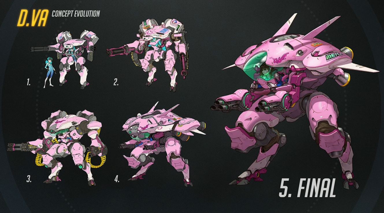
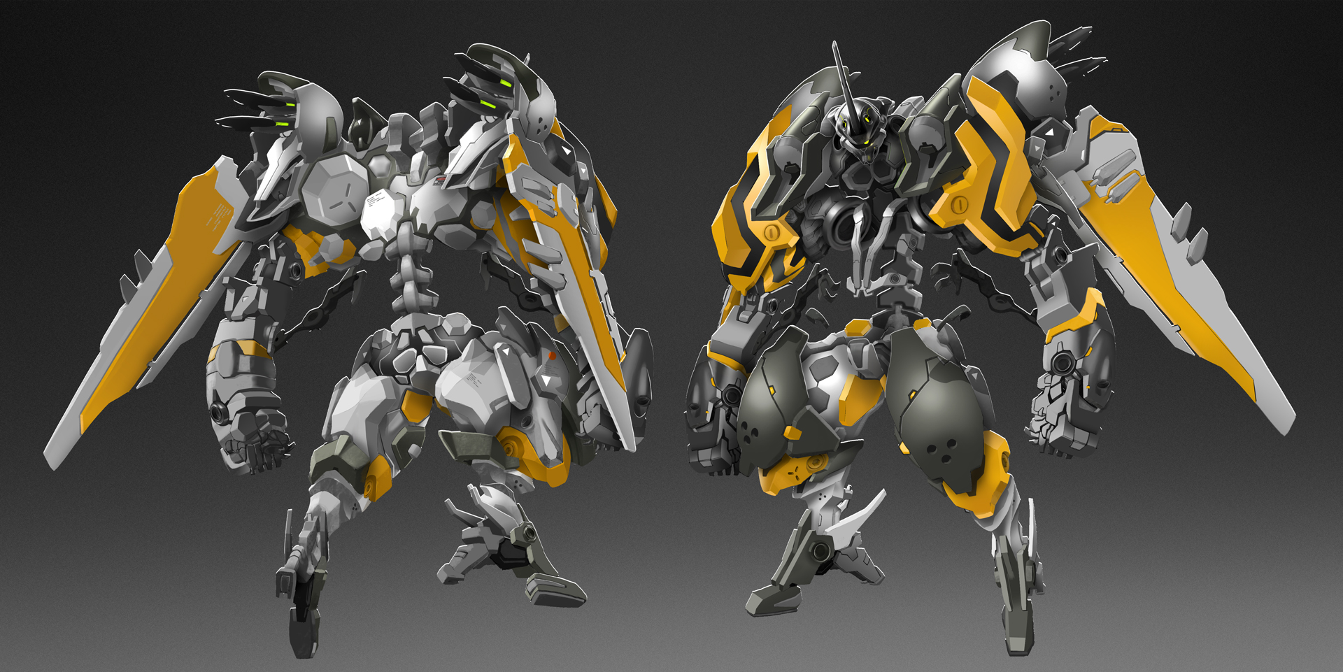
I feel like the last omniframe version would be like this pic with Diva, while the original mk1 concept art was closer to the 3 and 5 versions in the last pic.
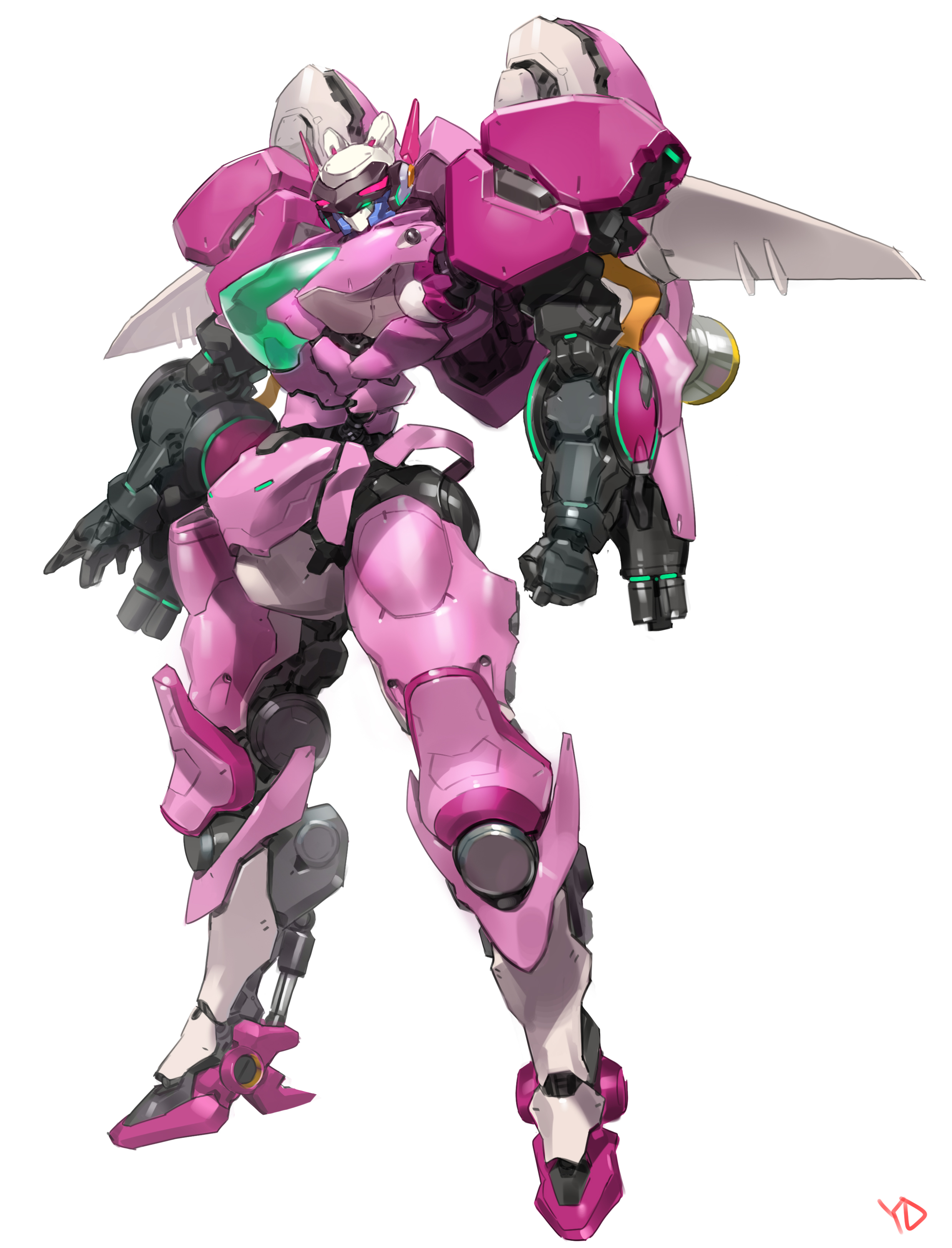
Again, its not bad to have a humanoid form, it just doesn't make it feel like a mecha and more like an exosuit/samus suit, and the more humanoid it is in proportions the less weight they tend to feel like they have when moving it you do that top heavy type of aproach I'm leaning towards (and that the final deva leaned towards). Where each step rocks a bit and the whole machine feels like its got some serious weight to it, for a human proportined unit to do that it doesnt have the same effect and doesn't stand out as well in gameplay/feel imo.
I also liked how the original concept has the more forward pointing angles on various parts, and feels a bit sharper with the heavier more industrial almost design, over the outright sleekness. Sure it had sleek over panels and parts but you could see some heavy solid parts poking through that were fairly big too. And they stuck out like they broke the flow of a human form a bit (the shoulder protrusions on the front sides for example, or the part that the wings were so big and plugged into the sides just near the arms pushing them yet a bit further out from the center of the body while requiring the shoulders part to clearly extend back in a way you wouldn't have if it was just a human shoulder going only to the arm (as opposed to how it looks more like the wing just plugs into the back of the human shoulder on the current omniframe version, rather than forcing the shoulder to change to fit it)). See how the original had its shoulders not just connect like some smooth section but broken up with mechanical parts and stuff that broke the flow and added that nice bit of negative space? Humans are single smooth forms with parts flowing together. Industrial machinery is often large separate parts stuck on to each other so they fit but still clearly separate parts with visible gaps in areas. Finer precision stuff (like medical equipment) often gets closer fitting parts with a cleaner form and as you move towards the hands and such where the detail work is important you get that, but the big weight carrying shoulders focus on the raw power over that finer form like with medical tech. All in all its just lots of little things like this that I loved about this design. All the little sharp parts, the large flat plates, the mixed in smooth parts that were well balanced, and the overall energy of it. But the biggest part was just how its overall silhouette was thanks to that proportion and shape, and then with the finer details having that nice mix of machinery and sleekness once you delve into the details.

Diva, she started off a bit closer to a more balanced looking type, but they moved more towards the larger top part with emphasis on engines and stuff feeling like they can move it. Key part I like with it is the part that it also clearly reads as a mecha with more mechanical parts and surfaces that don't just look like continuations of a human form or armor setup. Something they moved away from throughout her development. They made the mecha look more like a machine the user is in, rather than just a large robo human.

I feel like the last omniframe version would be like this pic with Diva, while the original mk1 concept art was closer to the 3 and 5 versions in the last pic.

Again, its not bad to have a humanoid form, it just doesn't make it feel like a mecha and more like an exosuit/samus suit, and the more humanoid it is in proportions the less weight they tend to feel like they have when moving it you do that top heavy type of aproach I'm leaning towards (and that the final deva leaned towards). Where each step rocks a bit and the whole machine feels like its got some serious weight to it, for a human proportined unit to do that it doesnt have the same effect and doesn't stand out as well in gameplay/feel imo.
I also liked how the original concept has the more forward pointing angles on various parts, and feels a bit sharper with the heavier more industrial almost design, over the outright sleekness. Sure it had sleek over panels and parts but you could see some heavy solid parts poking through that were fairly big too. And they stuck out like they broke the flow of a human form a bit (the shoulder protrusions on the front sides for example, or the part that the wings were so big and plugged into the sides just near the arms pushing them yet a bit further out from the center of the body while requiring the shoulders part to clearly extend back in a way you wouldn't have if it was just a human shoulder going only to the arm (as opposed to how it looks more like the wing just plugs into the back of the human shoulder on the current omniframe version, rather than forcing the shoulder to change to fit it)). See how the original had its shoulders not just connect like some smooth section but broken up with mechanical parts and stuff that broke the flow and added that nice bit of negative space? Humans are single smooth forms with parts flowing together. Industrial machinery is often large separate parts stuck on to each other so they fit but still clearly separate parts with visible gaps in areas. Finer precision stuff (like medical equipment) often gets closer fitting parts with a cleaner form and as you move towards the hands and such where the detail work is important you get that, but the big weight carrying shoulders focus on the raw power over that finer form like with medical tech. All in all its just lots of little things like this that I loved about this design. All the little sharp parts, the large flat plates, the mixed in smooth parts that were well balanced, and the overall energy of it. But the biggest part was just how its overall silhouette was thanks to that proportion and shape, and then with the finer details having that nice mix of machinery and sleekness once you delve into the details.

Last edited:
All I can say is - omg Omg OMg OMG OOMMMGGGG !!!!! - *** does bunny jumps around in circles ***
Brilliant work guys - the suit is looking fanatstic.
* btw, I dont think the suit needs to be bigger...like a massive trans tank. Its all ready huge, looka about 18-20 feet tall (relatively to human size). Whats important, it gives the impression that it is a mechanical exo suit to aid in all round work. An EVO with attitude !! *
Merry Christmas/holidays to you all and a happy New Year to !
- Status
- Not open for further replies.


