
I don't like the new forum layout
- Thread starter NoahDVS
- Start date

I know I've been afk for a while, however just coming back now, and seeing the new forum layouts, I'd have to agree with Noah on all these points. Although I do enjoy the color schemes, it is not layed out correctly, and has the issues listed above. Also, I have to go into each sub-section to see if there are unread posts in that area, where as the old style I could see just by looking at the entire forum list. Just my 2 cents!


Likes:
PIghead Elderberry
I know I've been afk for a while, however just coming back now, and seeing the new forum layouts, I'd have to agree with Noah on all these points. Although I do enjoy the color schemes, it is not layed out correctly, and has the issues listed above. Also, I have to go into each sub-section to see if there are unread posts in that area, where as the old style I could see just by looking at the entire forum list. Just my 2 cents!
I'm prety sure it's going to get better. this things happen when you first design something. It's going to need some tweaking. Also as we get closer to the game taking form I'm sure the colors of the forum will change to match those in the actual game. Just keep giving feedback and give it time.
having said that I'm going to give a little feedback to help with what noah pointed out about needing more contrast in the letters. in order for the letters to pop out more it would need an outline of a different opposite color. If the letters are white make the outline black. If the letters are yellow make the outlines blue and so on. Or have a colored bar under the topics with a 60% opacity. As for anything else I can see everything just perfect.
having said that I'm going to give a little feedback to help with what noah pointed out about needing more contrast in the letters. in order for the letters to pop out more it would need an outline of a different opposite color. If the letters are white make the outline black. If the letters are yellow make the outlines blue and so on. Or have a colored bar under the topics with a 60% opacity. As for anything else I can see everything just perfect.
Last edited:
I agree that at times the images and text on them match up in colors so that the text becomes invisible. Overall, I kind of like it as it is new and blue. I liked the old one just fine as well, however.
I have been hitting 'What's New" to get new posts, but I am not certain how that relates to 'latest' posts vs. 'unread' posts, for example...
Is that new to the forum, or new to me since last login?
I LIKE VERY MUCH the way that in a kind of live feed we see things like "latest posts" at the bottom. That just changed as I was typing. That is nice. Very nice!
Likes:
Pandagnome
The old linear layout was easier to read and navigate and the new one has some other issues:
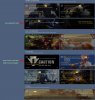
View attachment 1510 View attachment 1511
View attachment 1510 View attachment 1511
The inconsisent size is there and that's fine for me since it denotes different types of information. Titles vs description.
but the text contrast is stronger than the background image for me.
NoahDVS (and everyone else) what is your browser?
Likes:
Pandagnome
I'm using chrome and it looks different to me.
The inconsisent size is there and that's fine for me since it denotes different types of information. Titles vs description.
but the text contrast is stronger than the background image for me.
NoahDVS (and everyone else) what is your browser?
The inconsisent size is there and that's fine for me since it denotes different types of information. Titles vs description.
but the text contrast is stronger than the background image for me.
NoahDVS (and everyone else) what is your browser?
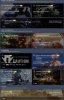
The contrast issue for highlighted thread titles was fixed. The titles now highlight in yellow, which is fine.
I use Firefox 59.0.2
This is what it looks like for me now:
Likes:
Pandagnome
I'm cool with it.
EDIT 1: After trying to find the general discussion thread to post a new thread in ( https://forums.em8er.com/threads/latency-equalization.1172/ ), I have to agree with the OP.
I like the design, but it is more difficult to navigate.
EDIT 2: So it turns out to not be as difficult to navigate as my first edit believed. Scroll to the bottom of the center panel and click on the link to the archive vault. Or just click this link instead: https://forums.em8er.com/categories/the-vault.31/
That's all the old stuff. The new layout streamlines things.
Last edited:
Likes:
Faeryl and Mahdi
as noah said in first post, forum index should be linear. u just created forum index as a portal view thats the problem, just put an extra xenforo site for portal view and redo forum index to its classic layout, thats how it works since decades and most ppl are familiar with and its really clearer.