Just a small forum design request + Poll

Is 100% black background comfortable for you?

  • Yes, I'm totally fine with it

    Votes: 26 78.8%
  • No, I would prefer the lighter color for it (something grey)

    Votes: 5 15.2%
  • No, and I would like to see a colorful background (bright red, blue, green etc.)

    Votes: 2 6.1%

  • Total voters
    33
Jul 27, 2016
27
23
3
Ukraine
#1
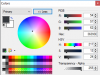
To be short: seeing white text on the pure black background makes my eyes hurt when I read posts on this forum. The contrast is too extreme. Or is it just me? I understand that it's a trend to have a completely dark background nowadays. But can it be tuned just a little, for a more grey color or something blue-ish like on FF forums. For example the background on our Discord channel is just perfect and friendly to eyes, I've sampled it, here's it's parameters:
EDIT: I've also noticed that on Discord the main text is not 100% white, it's very light grey, this is also important and very comfortable to read.
 

Attachments

Last edited:

Bl4ckhunter

Active Member
Jul 26, 2016
157
123
43
#2
it looks fine to me but i wouldn't mind a switch to a dark grey/blue/purple, anything goes so long as it's not white or too light of a color, i find black on white extremely jarring.
 

TankHunter678

Well-Known Member
Ark Liege
Jul 26, 2016
369
311
63
#4
I am fine with the black background, though I can see a request to add in some alternative forum backgrounds (and an option to disable the background image switching) going through.
 
Likes: DarkCisum

NoahDVS

Deepscanner
Jul 27, 2016
182
133
43
#5
Dark UIs are easy on my eyes. There is a theme you can pick with a light background and dark text, just go to your preferences. What I'd like though is to not have the website automatically run Flash whenever I visit it.
 
Likes: Sandsnake

Kouyioue

Active Member
Aug 1, 2016
145
119
43
#6
considering 100% (""99.9%"" is a sissy little copout, go big or go home, Wuss ! ! ! ) of fanforums use this dumb generic black-theme phpBB template, it is kinda annoying.

But i'm fine with it here, since people actually post here frequently ^_^
 
Jul 26, 2016
45
76
18
Switzerland
darkcisum.com
#7
It's not really black is it though?
I like the grey, but I personally would probably adjust the text brightness a bit, i.e. make it slightly more grey.

The background image switching should be an option. Then again adblocker is doing its fine job so far, just feels a bit stupid having to use it. ;)
 
Jul 28, 2016
141
178
43
33
Florida
www.facebook.com
#10
Xenforo features optional, user selectable themes. If you find a free one you like, I can install it for you and you can select it as your default.
^
This would be a nice feature! The revolving pictures distracts me, what if we had the option to choose between either black or one of the three rotating images?
 
Jul 26, 2016
45
24
8
#12
i always prefer the content being brighter than the background.

because your eyes are naturally drawn towards bright things, or things that stand out. the background being brighter than the content of the page is an amateur mistake that many people make.
there's a lot of things i facepalm about in regards to Web Design or UI Design. so many rookie mistakes that break fundamental rules that are there for very good reasons.

here's what this Forum looks like for me atm. i'm very fine with this. obviously i'm doing some stuff Client side.
http://i.imgur.com/5VocEzM.png


i am, however, biased towards these sorts of things even though they do follow rules based around human function, as can be seen by other things i customize the look of:
http://i.imgur.com/dzOergE.png

I understand that it's a trend to have a completely dark background nowadays.
the trend is actually having a 255,255,255 background and then having text of various neon colors.
with everything else also being eyesearing white. white on white on white on white is the current 'hip trend' in all types of User Interfaces. or rainbow colors.